
SPECULATIVE APP DESIGN
Affordabode
PROJECT SUMMARY
Addressing complexities of affordable housing by designing a mobile app that makes resources and tools available to hopeful young renters
DURATION
Sep - Oct 2022
(4 weeks)
CONTRIBUTIONS
Concept Ideation
User Research
Competitive Research
Interaction Design
Prototyping
Animation Design
TOOLS
Figma, Adobe Illustrator, Zoom, Google Forms, Optimal Workshop, Whimsical, Miro, FigJam

Availability of affordable
housing is the top concern
for young Americans
It’s not enough that young adults are spending up to 30% of their monthly income on housing costs alone, impacted by inflation, rising rent prices, and the ripple effect of Covid-19.
They’re also unaware of the proper tools to access and make sense of the information they need to apply for affordable housing programs in their community.
Affordable housing often carries a preconceived notion and a social stigma that pushes people away from their dream of finding a safe place to live.
How might we?
...help potential home renters feel empowered and confident to make an informed decision in their journey of finding an affordable place to live?

SOLUTION
Not just another
housing app
Affordabode’s goal is to assist users in the search for stable affordable housing options and provide valuable information on how they can access programs for low-cost units in their local communities.
More than an engaging and interactive product, it's more in line with treating housing as a human right than as a commodity.
KEY SOLUTIONS
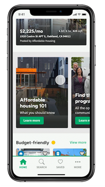
Resources at your fingertips
Affordabode can narrow the search for a rental according to users’ needs through the Home screen.
Based on their location, users can access information on what they need to know about affordable housing, an eligibility checklist, local programs, and housing expert directories.

Keeping it transparent
A comprehensive description of the property is presented as well as an overview of the neighborhood in which it is located.
Feedback is received from third-party platforms, agents, realty groups, and the Affordabode community at large.
Express route to a viewing
Users can let property listers know of their availability on a given day through a scheduling process that also involves submitting their contact information.
They’ll be able to have access to the agent’s own contact, and directly communicate with them as they set up the tour of the desired property.

COMPETITIVE ANALYSIS

Many options...
and just as many faults
While there is no shortage of digital apps dedicated to housing, very few of them provide relevant information about a listing’s price history, and an estimated annual income required to afford it.

USER RESEARCH
Navigating between taxing frustrations and sketchy practices
I made an open call to my network of friends, acquaintances, online followers, and members of Bay Area/Design Discord communities to answer a Google Form survey where I paid close attention to their current experience with housing apps, their aspirations, challenges, and reasons to overcome those and their familiarity with affordable housing.
Nine survey respondents
between 22-45 years expressed...

being in the middle ground between dissatisfaction and total satisfaction with housing apps

valuing location
and neighborhood quality in housing options that fit their budget

skipping listings that are out of their financial reach and goals
their knowledge of affordable housing programs varies (not so familiar to somewhat familiar)
There were further insights on the user interviews I personally conducted with four individuals between the ages of 20-45 that were either currently renting or owning a home, actively looking to rent or own a home, and frequent users of housing platforms and Facebook groups.
-
Neighborhood features are only one aspect of a series of criteria that users follow in their search for housing.
-
Users are eager for a more transparent experience, including direct communication with property listers.
-
More often than not, they are unaware of legal protections as renters and/or homeowners.
-
They are frustrated by skimming through loads of information on different housing apps and are persuaded to pay a fee in advance to view a property.

MEET THE USER

Fern
Finding a place to live can be so stressful and time-consuming, not to mention quite frustrating to deal with folks who want to take me for a ride...
Fern has saved enough money to start looking for a place to live that is aligned with her personal goals as well as her budget.
FRUSTRATIONS
Volatility of housing market in her community, high rent prices, and scammy online practices.
INFORMATION ARCHITECTURE & INTERACTION DESIGN
Building streamlined app navigations
Based on the understanding I had from the users’ journey through their preferred housing apps, I developed a navigation system that would take them on various ways to access listing information, and give a direct link to affordable housing resources.

SKETCHES & WIREFRAMES
Walking in and out the door
For the sketches and subsequent wireframes, I envisioned a welcoming journey reminiscent of social media and popular housing apps, guiding users through a tour scheduling stage.


UI DESIGN & BRANDING
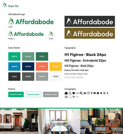
A safe and humble abode
Halfway through the process of fleshing out the app, the obvious choice was to land on a name that would exemplify both the quest for an affordable home and a raised awareness of affordable housing.
I was inspired by previous interviewees’ comments to conceive brand keywords such as “reliable,” “guiding,” “resourceful,” “togetherness,” “familiar,” and “onward,” further enhanced by the green and blue tones of the color palette.
USABILITY TESTING
A funny thing happened on the way to schedule a tour…
Six people between the ages of 21-45 took part in remote and moderated tasks to test the look and feel of the Affordabode app, browse through the search feature, detail a listing’s description, and schedule a tour of the desired property.
The app feels very easy to use and understand
The “Search” feature feels intuitive
Listing information
is very useful
Affordable housing resources are helpful tools
Price tags changing color when visited is a nice touch
Very little friction with the overall scheduling process
One pain point I uncovered was the fact that the messaging of the scheduling process was not consistent, an element that flew past me after doing the wireframing for it.
Users were confused upon seeing this screen, as it gave the impression that they had “booked” a tour when, in reality, they had just sent their availability in the previous step.


An improved heading and copy were included after the usability test insights, as well as contact information from the listing agent who would confirm their availability.
REFLECTIONS
Usability needs no translation: One of my user interviews was with an individual who currently lives in Mexico City. I had some doubts about whether his concept of affordable housing matched that of user interviewees living in the United States.
Not only did he express feelings in sync with my research of the affordable housing landscape (especially its misconceptions) but he also noted certain UI/UX issues that came up while presenting my first iteration of the Affordabode prototype.
Watch out for misleading copy: The importance of clear written information on a prototype cannot be understated. It can go as far as making or breaking an entire piece of work.


