
NEW APP FEATURE
OpenTable Fine Dining
PROJECT SUMMARY
Helping OpenTable stay competitive, and continue to provide excellent user experience by incorporating a new feature to book a table at exclusive restaurants
DURATION
July 2022
(4 weeks)
CONTRIBUTIONS
User Research
Design Audit
User Stories
Competitive Research
Interaction Design
Prototyping
Animation Design
TOOLS
Figma, Google Forms, Zoom, Whimsical

One foot in...and one foot out
OpenTable is facing some heavy competition in the online restaurant reservation landscape it singlehandedly pioneered back in the late 1990s.
Though it continues to seat more than 1 billion diners in 60,000+ establishments worldwide, upstarts like Resy (owned by American Express) and Tock (property of Squarespace) have been growing a steady list of subscribers and providing more sophisticated options for diners already familiar with OpenTable’s modus operandi.
How might we?
...encourage affluent OpenTable users to stay connected with the platform, and continue to experience the high quality restaurant service they’ve come to expect from it?


SOLUTION
What luxury dining could look like at OpenTable
The concept was to enhance the current experience at this highly-popular restaurant reservation platform by habilitating a feature that lets OpenTable users explore a list of exclusive and award-winning establishments in their location, read through their philosophy and reviews, and ultimately, book a seat as they have done before through the app.
KEY SOLUTIONS

Easy access to sought-after restaurants
Browse top dining options nearby by type of cuisine, and explore Michelin-starred establishments.
User-generated proof
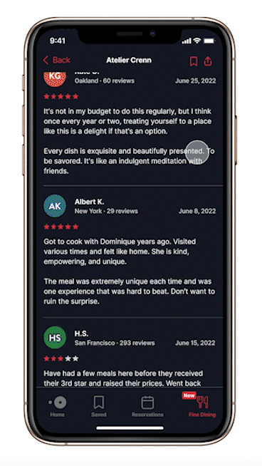
Read through latest menus and what other OpenTable users have to say about the restaurant of your choice.

A few taps to a dining out experience
Specify seating options and special requests. Share with guests and manage the reservation.

COMPETITIVE ANALYSIS
Serving (and rewarding) users
The various digital apps and online websites out there offer more than just making restaurant reservations easy.
Like OpenTable, some of them have a range of services including delivery/pickup, wine tasting, and local experiences that are affordable and accessible.

USER RESEARCH
For OpenTable users, good is not good enough
I gathered insights from 15 survey respondents, who were recruited through my personal network of friends and acquaintances. Their comments confirmed a lot of my thoughts coming into this project:
The majority
make restaurant reservations to discover new places in town and celebrate special occasions
8 out of 15
prefer to book their reservations in advance, especially if there's a waitlist involved
7 out of 15
believe the lack of available and preferred seating is their biggest challenge when reserving a table
Based on this, I decided to map a storyboard that helped me fully visualize their process.

I wanted to dig deeper into my user interviews and understand what customers value when they interact with OpenTable or other restaurant booking apps, as well as their goals, and frustrations when booking tables at popular and exclusive restaurants.
Six individuals between the ages of 23-54, and who currently use OpenTable or competing platforms, were interviewed for this study. They were recruited through my network of friends, and through Slack and Discord communities.
-
They acknowledge OpenTable and competing platforms’ ease of use to process a reservation.
-
Most have actually booked tables at upscale and high-end restaurants but not on OpenTable.
-
They've also noticed certain establishments they know are not available on the platform at all.
-
In the event of tables being unavailable for a specific reservation, users need to have a reassuring way that they’ll be alerted of future openings.


INTERACTION DESIGN
More than one way to book a table
A bit of information I noticed throughout my user interviews, which inspired the user and task flows I designed for this project, was that many of the people in the study interacted with OpenTable in different kinds of ways.

WIREFRAMES
Determining the hotspots
For the Fine Dining wireframes, I stayed within the constraints of the current OpenTable design and ease of use during the process of making a reservation, while at the same time, introducing patterns that have worked in other platforms, and that could help within the context of OpenTable.


USABILITY TESTING
Users crave for a unique yet familiar feel to their OpenTable experience
I recruited four participants between 24-53 years old who have had different degrees of experience using OpenTable or similar platforms like Resy or Tock to take part in a series of tasks, which involved:
Examining the OpenTable iOS home screen
and expressing impressions of the overall digital product
Navigating through the Fine Dining feature
including categories and restaurant profile page
Completing restaurant booking
through seating selection, detail review, and final confirmation
All four individuals agreed the interface felt very intuitive, and it reminded them of their previous experience with OpenTable or other platforms such as Grubhub and Doordash.
They also appreciated the note of important information such as “Pricing,” “Dress Code,” “Health and Safety,” and “Accessibility,” and the quickness of the entire reservation process.
I discovered the following desired features during the usability testing stage:


Users found it difficult to easily locate the Fine Dining feature so a visible introduction to it was added to the home screen as well as on the nav bar.
There were notes on the "crowded" nav bar, which I was able to address by repositioning the "Search" and "Updates" icons to the top.
The "Browse by Cuisine" card carousel was also repositioned from the bottom of the page to the top.
In the Fine Dining section, there were comments on the lack of different restaurant categories and reservation timetables, the latter of which presented difficulties on the user journey.
These issues were addressed in the iteration stage.
The lack of useful resources like menus, seating options, and user reviews prompted a problem for testers.
In addition to incorporating popular dishes, reviews, and an "Overall Rating" to the restaurant profile page, there was extended information about the establishment, its main chef, and a payment method screen to seamlessly secure a reservation.
REFLECTIONS
Skin deep to find the actual problem: Sometimes, what would stand out as a “problem” is not always very apparent, as I came to discover throughout this project when I stumbled upon something that I thought was a problem but was more of an opinion.
It’s in one of these instances where I had to step outside of it all for a moment and take an even closer look at an idea, seeing all the different angles from the user and the business standpoint, and framing the problem as needed.
Prioritize on desired features: I was fortunate enough to get plenty of insights from my usability tests, and all the while, I could trace definite patterns of what needed to be improved on. My attention was on those elements that could provide the ultimate value to the user.


